
Fashion and Color Theory
No matter your style or the type of clothing you wear, choosing the right color combination can drastically improve your outfit. Remember, who you are and your unique style play a significant role in fashion. While color theory provides guidelines, there’s always room for creativity and individual interpretation. Experimenting with colors and finding what works best for you is a great way to develop your own sense of style. Even if you wear sweats every day, learning a little about color theory can enhance your style and make you stand out.
What Is Color Theory?
Color theory consists of guidelines and principles that help people choose and combine colors in clothing to create aesthetically pleasing and coordinated outfits. Choosing the right colors can make you appear more expressive, leave a visual impact, and even have a psychological effect on others. For example, warm colors like red and orange are often associated with energy and passion, while cooler tones like blue and green evoke calmness. Fashion color theory enables individuals to leverage these psychological influences in various social and professional settings.
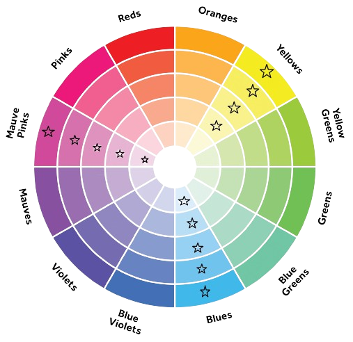
Have you ever wondered why certain colors look good together? There’s a science and method behind it. Take a look at this color wheel:
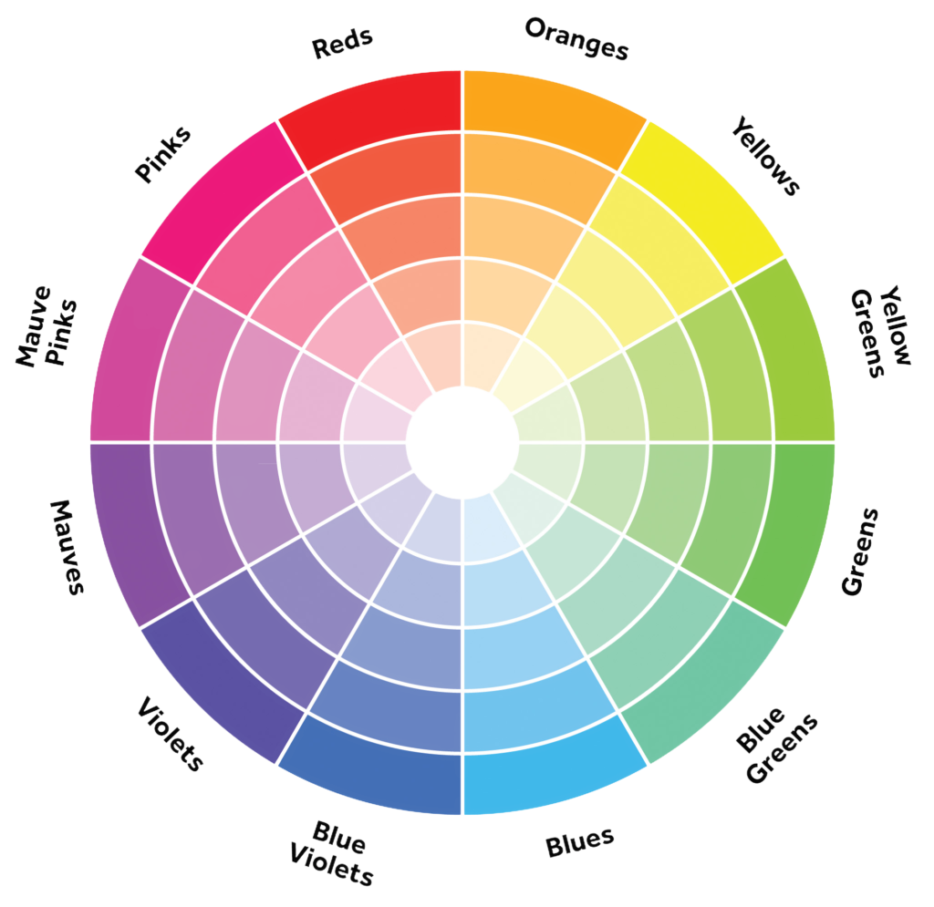
Once you choose your favorite color or a color you would like to dress around, consider the location of that color on the wheel and the style you are aiming for. There are specific colors that can complement or even clash with your chosen color. Learning a few color schemes and styles will give you a deeper understanding of what to wear with your favorite pair of pants or shirts.
What Makes Up a Color?
The three components of color we will be focusing on will be:
- Hue
This refers to an object’s pure and basic color, simply a more technical way of saying what color something is. - Saturation
This is the intensity or vividness of a color. It describes the purity or concentration of a color in relation to its brightness. A highly saturated color is vivid and pure, while a desaturated color appears more muted or washed out. - Luminance
How dark or light the color is. (to be more correct, how much light is in a color)
Keep in mind that black and white are not colors but shades. They are fantastic in almost any outfit due to the contrast they can add. Also, please be aware that not all shades and saturations are equal in clothing. For example, those who enjoy an all-black aesthetic will notice that many of their ‘black’ clothing items differ from one another when compared side by side.
Basic Color Schemes
There are practically infinite color combinations that may work for you. This can be great for keeping things fresh, but it can also be a bit overwhelming due to the sheer number of options. Hopefully, this guide will give you a better understanding of your style or what you might want to try next. Take some time to experiment with which colors and saturation combinations you think would look best with your style.
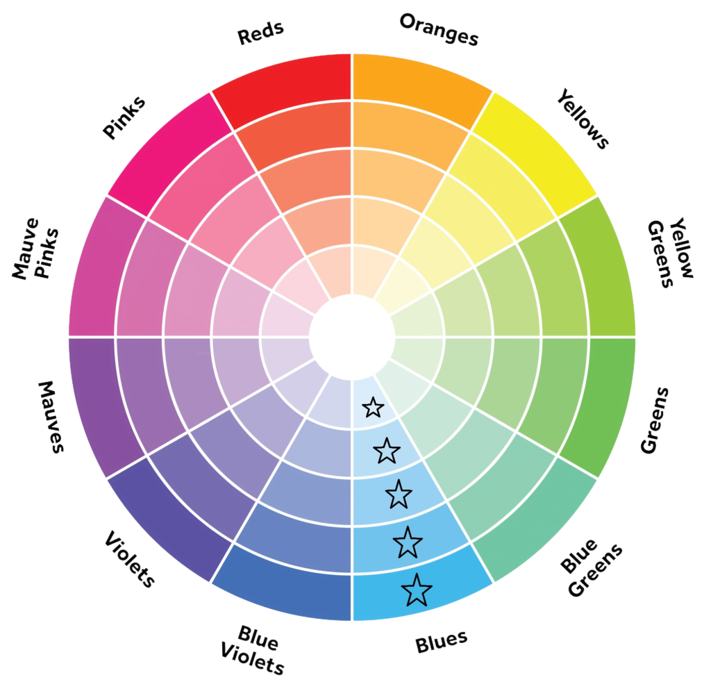
Monochromatic
Is a color scheme that consists of variations of a single color. In a monochromatic color scheme, you can achieve many different styles by simply changing the shade of the color and adjusting the saturation and luminance to create a stylish outfit.
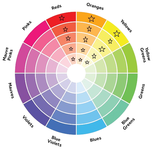
Analogous
This color scheme refers to the colors adjacent to the chosen color. Analogous colors look good together because they share similar color traits while also giving a good contrast to one another.
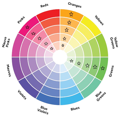
Complementary
This color combination is colors that are on the opposite side of the color wheel. This color scheme gives high contrast and can make your outfit appear brighter and bolder.
Triadic
A triadic color scheme is a color palette derived from three evenly spaced colors on the color wheel. These three colors form a triangle when connected, creating a balanced and visually appealing combination
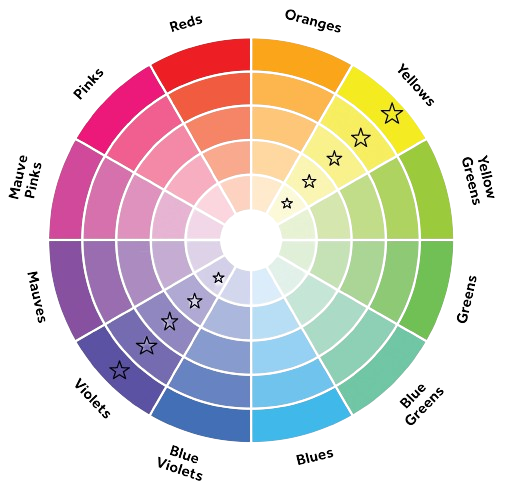
Split-complementary
The split-complementary color scheme is a variation of the complementary color scheme in color theory. In a split-complementary scheme, instead of using the direct opposite (complement) of a base color, you use the two colors adjacent to its complement. This results in a color palette that retains the strong visual contrast of complementary colors while offering more nuance and variety.
- Choose a Base Color:
Start with a base color, often one that you find appealing or suitable for your outfit. In this example we chose green. - Identify the Complementary Color:
Find the direct opposite color on the color wheel, which is the complement of your base color. The complementary of green is red. - Select the Split-Complementary Colors:
Select the adjacent colors of the complementary color.
Applying Color Theory To Fashion
Next time you’re wearing your favorite article of clothing or you’re out shopping try not to only think about what other clothes it would look good with. Think about what color can also really help bring it out. it’s amazing how much your outfit can change by simply changing the color.
Some great resources to discover and experiment with color schemes are Color Hunt and Canva